
Healthy Food Tracker for Kids
Google Design:
Interaction Design Prompt 3
Getting kids to commit to nutritious choices can lead to a healthier lifestyle. Schools have the opportunity to foster good habits early on. But accommodating picky eaters and dealing with outside influences, such as the media, family, and peers, can be daunting. Design an experience where schools can influence students’ food choices.
RESEARCH
Before brainstorming I started out with some reading to explore the topic of the design exercise and gather my initial thoughts. I did some competitor research to see how other products were tackling this taking notes of the things I did and didn’t like. Just roughly penning down what features the app would need, what information would need to be shown, and what pieces of content should be in focus.


FINDING THE PROBLEM
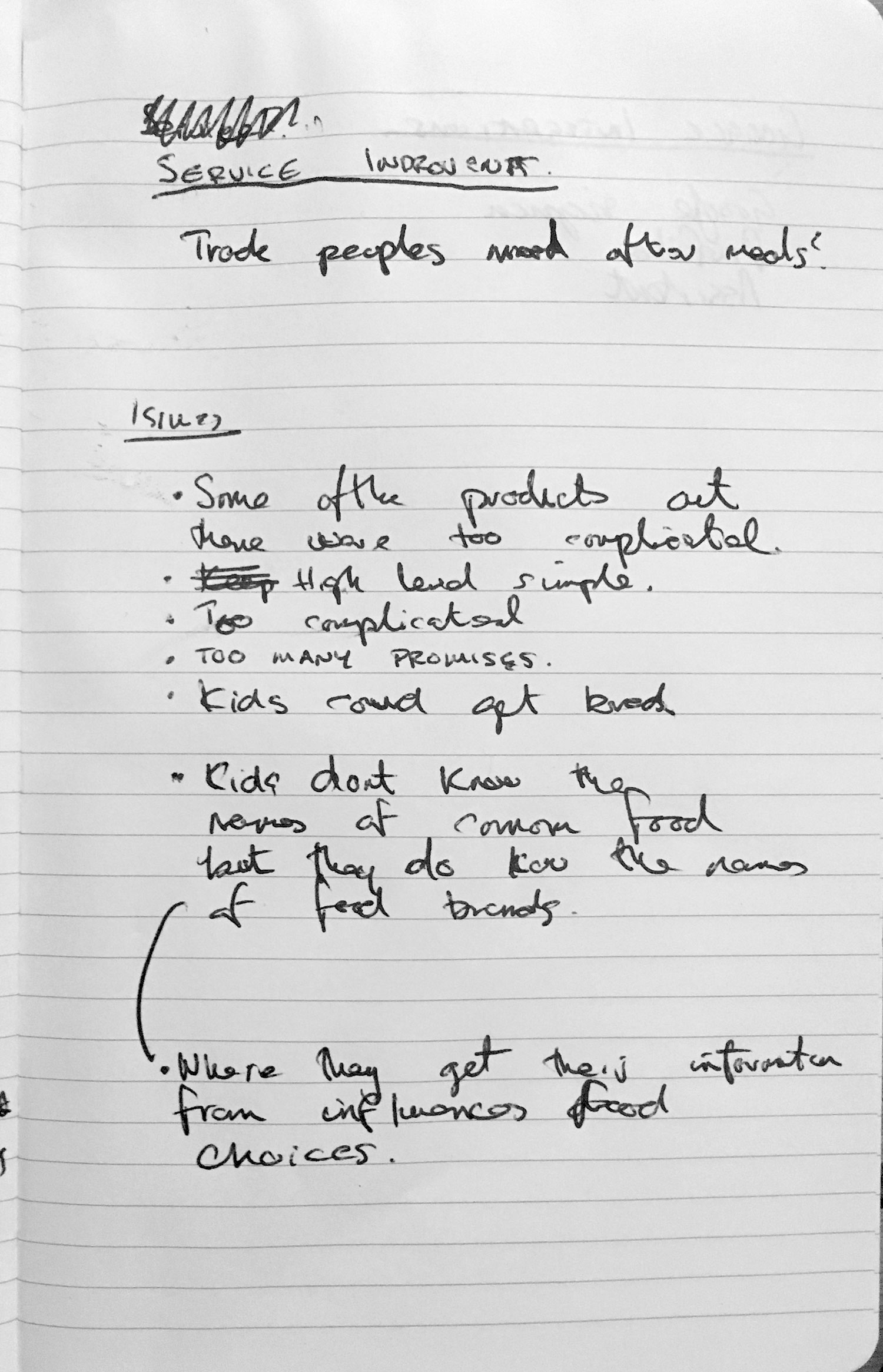
Before we start solving anything we should take a look at the issue at hand and break it down to its root causes. We want to make it easier for kids to commit to nutritious food choices. The underlying problem is that children obtain information about food from sources not independent of the food industries such as commercials and advertising. This is problematic because studies have shown in the classroom poor food choices lead to issue around concentration, and as a result poor academic performance. Additionally children have a poor understanding of how food is produced.
So why do kids make poor food choices?
As I discovered in the research phase children sometimes don't have an emotional relationship with food as they do with food brands.
- Children develop unhealthy food preferences shortly because of who they get their information from.
- As a result they don’t feel the same way about food as they do about food brands.
- Some of the apps out there were complicated.
- Food apps had a strong emphasis on losing weight.
- Unless the food tracker did everything automatically without the need for user interaction.
- I wasn't sure if kids would simply get bored.
SOLVING THE PROBLEM
Keeping things in mind I decided on the following mission statement:
This would be achieved through these three goals:
Keeping things in mind I decided on the following mission statement:
Promote an emotional relationship with food
This would be achieved through these three goals:
There was a social element which would fascinate the users and provide everyone with a new place to get information about food.
Create a connection between food choices and mindfulness.
It would require the minimum of input from the user.
SKETCHES & WIREFRAMES
And idea was already pretty clear after the phases above. So I could jump straight into a quick paper scamp to map some initial thoughts.
And idea was already pretty clear after the phases above. So I could jump straight into a quick paper scamp to map some initial thoughts.
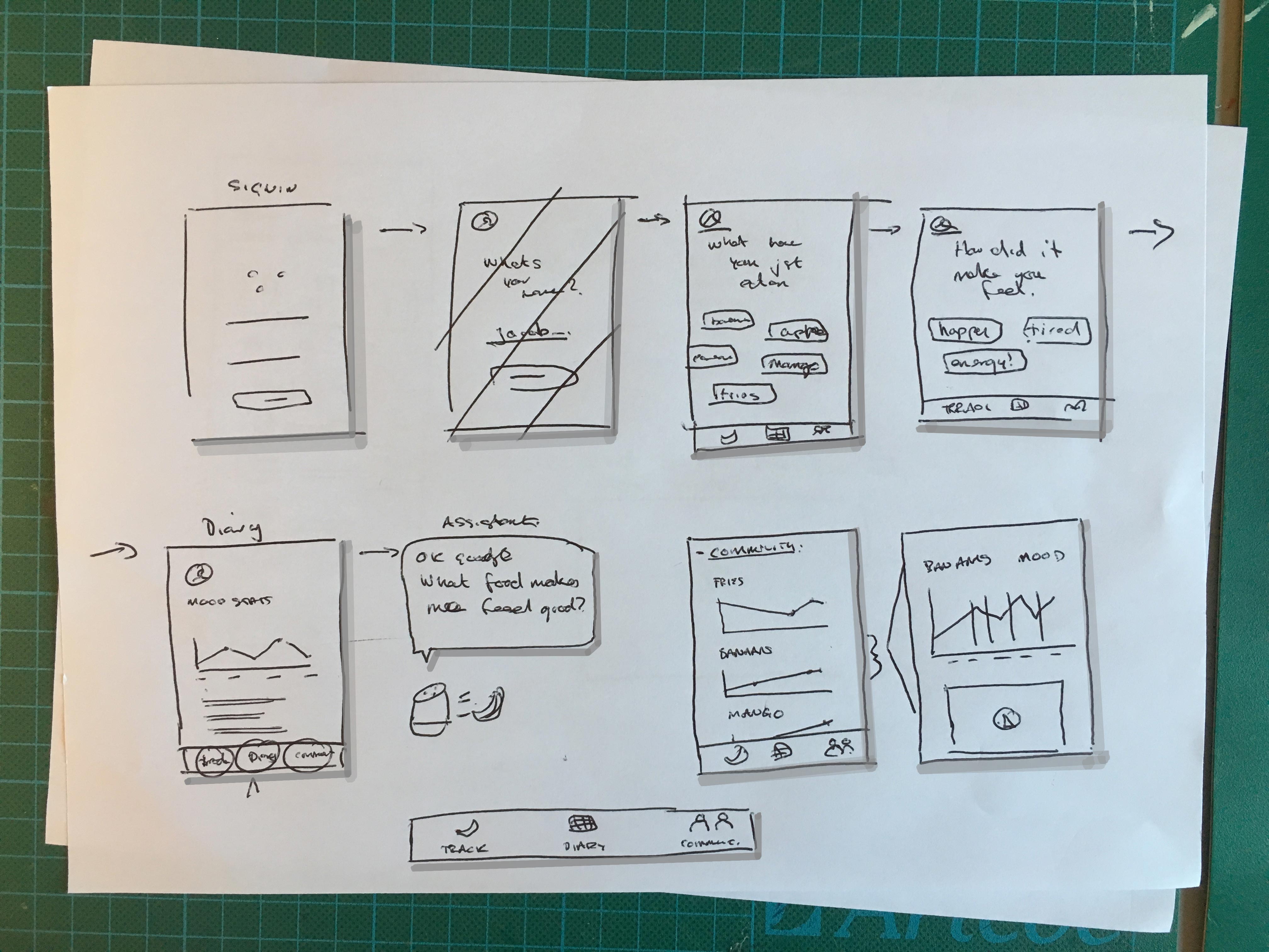
After a couple of paper iterations I had the general idea ready, so I switched to Sketch, where it’s easier to move things around. This was the final result of the user flow after a couple of iterations in:

I opted for bottom navigation with three views:
Each tab represents a different cycle in the users progress towards having a better relationship with food.
Notifications are something which could help encourage better food choices and these could be individually tailored based on the user or communities past interactions. E.g “Have a glass of water with your lunch to feel energised this afternoon”. This alone provides a very strong USP.
This also means that as soon as the user tells the app how eating a piece of food made them feel, multiple other children immediately benefit from that insight.
- Track
-
Diary
- Community
Each tab represents a different cycle in the users progress towards having a better relationship with food.
Notifications are something which could help encourage better food choices and these could be individually tailored based on the user or communities past interactions. E.g “Have a glass of water with your lunch to feel energised this afternoon”. This alone provides a very strong USP.
This also means that as soon as the user tells the app how eating a piece of food made them feel, multiple other children immediately benefit from that insight.
MOMENTS TO EXPLORE
At this stage other important parts in the user flow to concept could be:
At this stage other important parts in the user flow to concept could be:
- Sign up / Application
~ Signing up for your service is the first real moment.
~ How do we make this emotionally exciting?
~ How do we make the potential collaboration for our user feel positive and useful?
- Welcome
~ This is your first impression.
~ How do we make this moment something to remember and talk about?
- Nurture
~ Daily usage, how can we make those small moments special?
~ Create incentives for frequent use, such as rewards or content related to your community interest.
- Tenure/ Anniversary
~ They use this service everyday, it’s now the end of the first month and we want to recognise the collaboration.
~ 1 year of membership. Lets recognised their commitment to the community. Let's not be absent minded.
High fidelity
UI
The app doesn't have a lot of controls and its structure isn’t very deep. This is deliberate, firstly because of its intended audience, which are children at school. And secondly because the purpose of this tool is to provide small valuable insights once or twice a day. It’s only intended to be used until the child has a healthier emotional relationship with their food.
The app doesn't have a lot of controls and its structure isn’t very deep. This is deliberate, firstly because of its intended audience, which are children at school. And secondly because the purpose of this tool is to provide small valuable insights once or twice a day. It’s only intended to be used until the child has a healthier emotional relationship with their food.
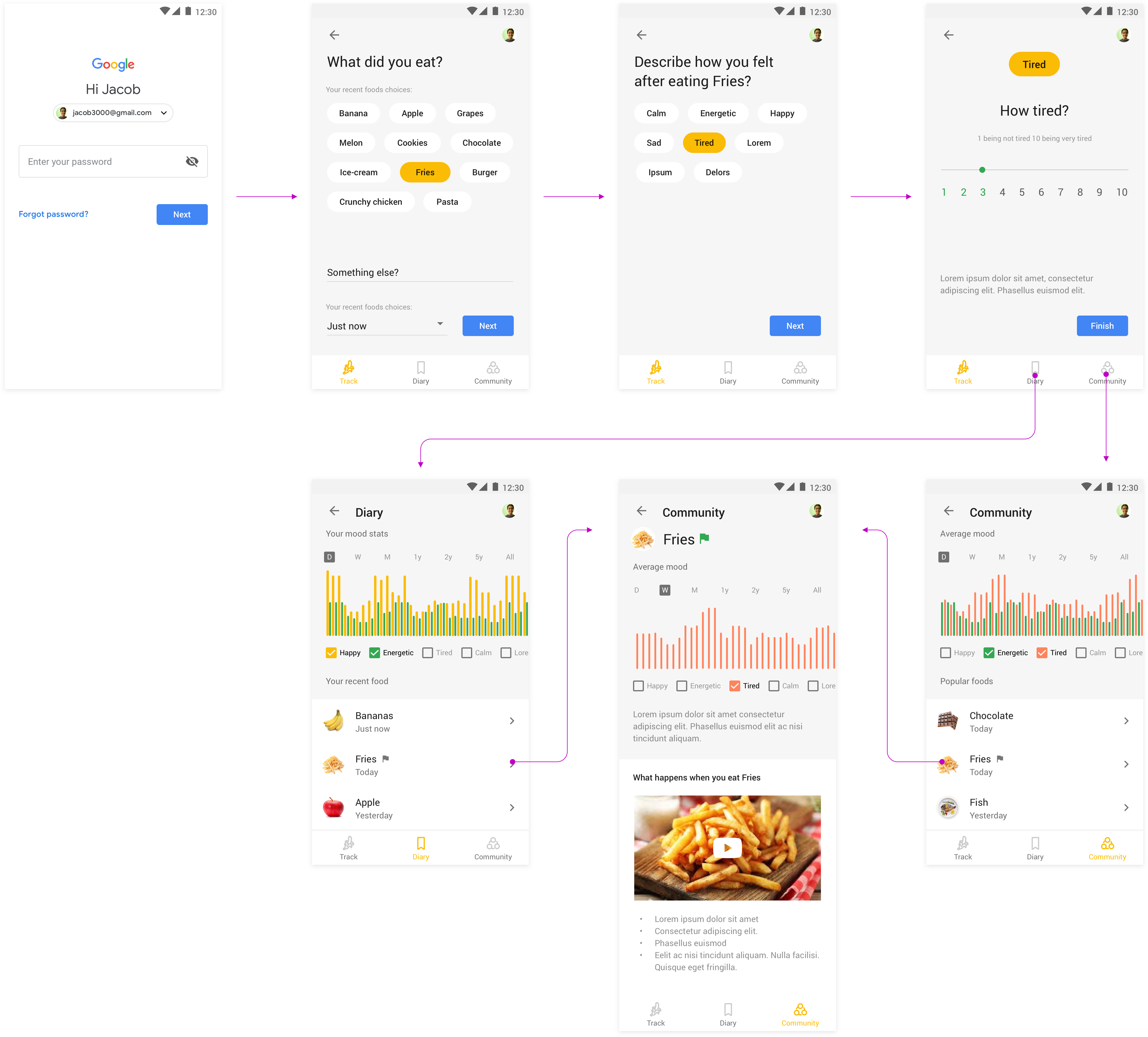
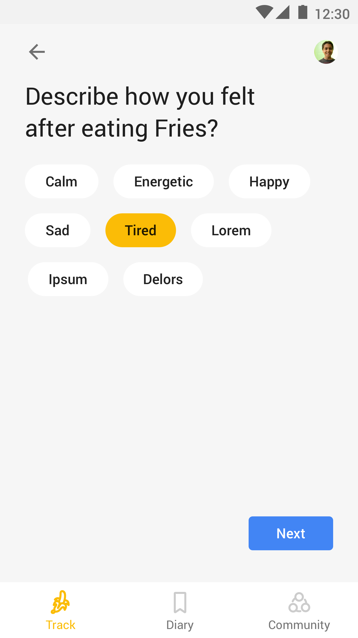
TRACK VIEW:
In order to encourage usage the app only asks two questions:
In order to encourage usage the app only asks two questions:
- ‘What have you eaten?’
- ‘How did it make you feel?’
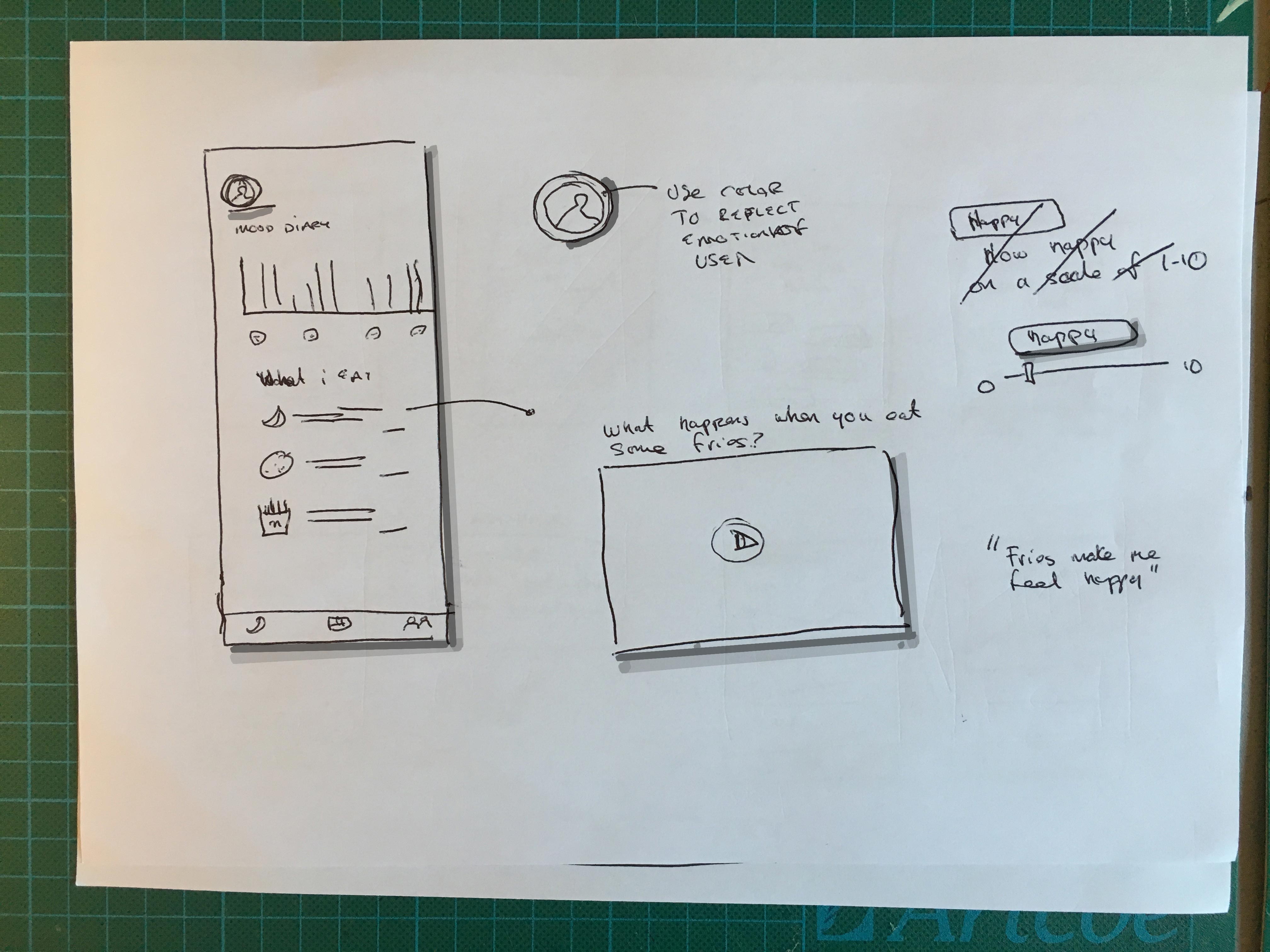
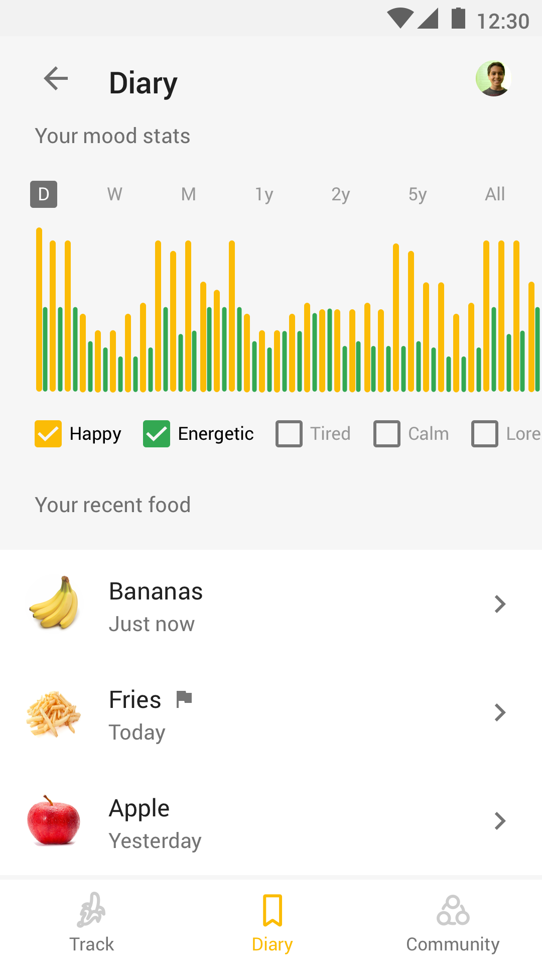
DIARY VIEW:
This allows the user to track how different foods have made them feel. By showing this information the user should start to see a picture of what foods make them feel good and perform better at school.
This allows the user to track how different foods have made them feel. By showing this information the user should start to see a picture of what foods make them feel good and perform better at school.
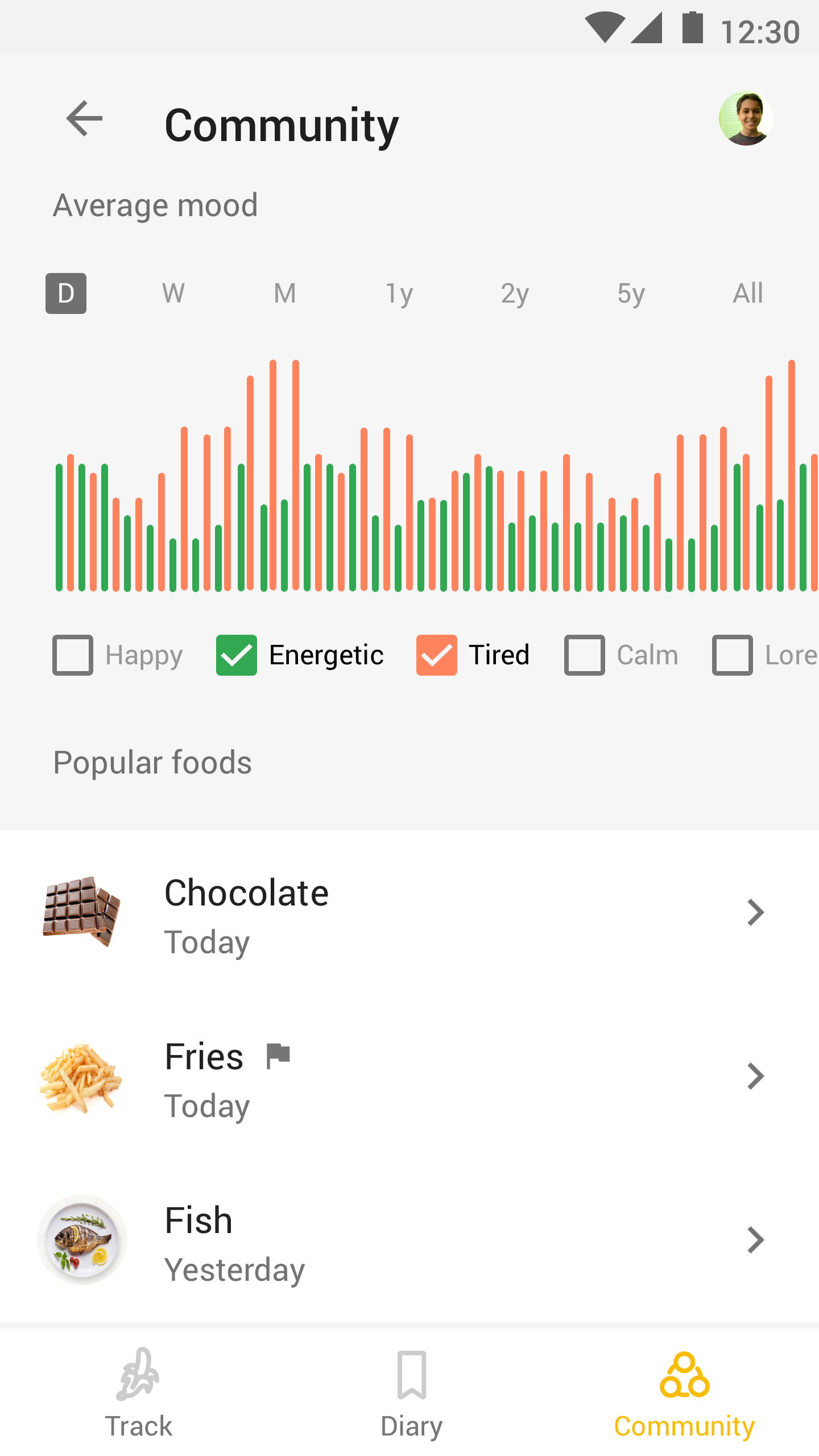
COMMUNITY VIEW:
This shares the same structure as the diary view but offers a different exploration experience. Here the user finds other food they were not familiar with. This would aid in increasing the variety of food choices within their diet.
The definition of the community could be eveyone who uses the app or just other children within the same school. Both have their own advantages but I can see how this could be used by teachers to influence their own students food choices.
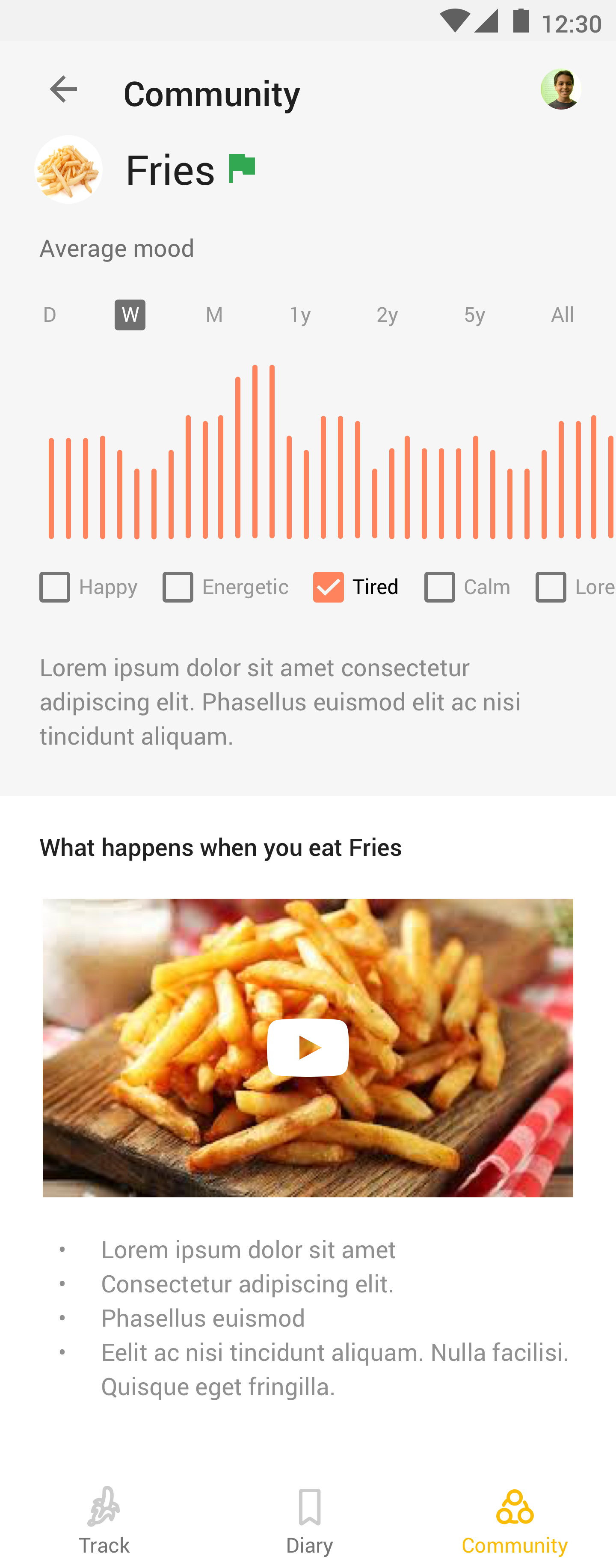
Information pages about certain foods were created with the purpose of showing you what affect it has on your body.
This shares the same structure as the diary view but offers a different exploration experience. Here the user finds other food they were not familiar with. This would aid in increasing the variety of food choices within their diet.
The definition of the community could be eveyone who uses the app or just other children within the same school. Both have their own advantages but I can see how this could be used by teachers to influence their own students food choices.
Information pages about certain foods were created with the purpose of showing you what affect it has on your body.
GOALS
To achieve the goal of helping kids understand how different foods makes them feel, there are many other services and products this could be integrated into. One that I think could be especially interesting is Google Assistant as this product is meant to step in and provide small useful moments once or twice a day for the user.
Overall I’ve had a lot of fun and enjoyed putting this together.
Thanks for taking a look!
© Asif Khan 2025